
Balayage vs. Highlights: A Practical Comparison
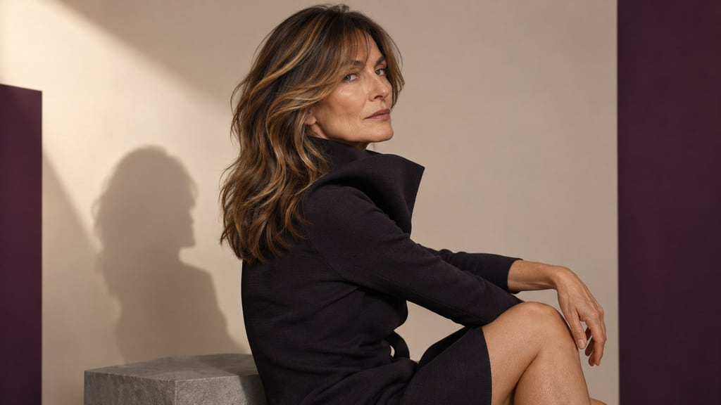
Compare placement, root visibility, and desired brightness before choosing between painted balayage, foil highlights, or a combined approach. The technique name alone cannot tell you how gentle the service will be or what your starting hair can achieve.

Painted balayage can place selected lighter ribbons through the lengths while retaining a softer-looking root. Foil highlights can make regularly separated sections brighter closer to the root. A combined approach can use both patterns in different areas. Start with the visible result you want, then ask a colorist which method suits your base and color history.
Read the Color Direction Before Choosing a Look
In a back-three-quarter view of brunette hair, trace each lighter section from its starting point to the ends. Notice whether lightness is concentrated through the lengths or repeats near the part and hairline. Compare the depth of the dark and light sections separately from their tone, or visible color direction. Wella’s color chart uses the number before the stroke for depth (how light or dark hair is) and the number after it for tone. That numbering belongs to Wella’s system; other brands may use different codes.
The same placement can look different when the lighter pieces have a warmer or cooler reflection. Likewise, two references can share a tone but differ in how bright the sections appear against the base. Describe both differences before naming a technique. Painted balayage and foil highlights are options for arranging lightness, not a ranking of appearance. Their names do not establish a fixed damage level, price, visit frequency, or finished result.
Compare Painted Balayage, Foil Highlights, and a Combined Approach
Use the same starting depth, camera angle, and light when comparing references. Look for where the strongest contrast sits, how close lightness begins to the root, and whether the tone stands out against the brunette base.
| Direction | Visible placement | Root appearance | Brightness to discuss |
|---|---|---|---|
| Painted balayage | Selected lighter lengths with varied starting points | More brunette depth can remain visible near the root | How bright should the painted ribbons look against the base? |
| Foil highlights | More regularly separated lighter sections | Brightness can extend closer to the root | How fine or prominent should the repeated ribbons be? |
| Combined approach | Closer-to-root brightness in selected zones and a softer transition elsewhere | The boundary can differ by area | Which zones need the strongest contrast? |
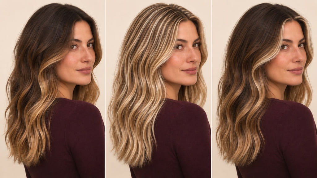
For a first shortlist, compare A, painted balayage with lighter lengths and a quieter root, against B, foil highlights with more repeated brightness near the scalp. If you want B near your face but A through the back, use the combined row as your reference. The photo helps you describe zones; a colorist must assess the actual service.
Painted Balayage
In this example, selected lighter lengths appear against retained brunette depth. The visible root transition is softer because the ribbons begin at different heights. Keep the same face, exposure, and approximate depth when comparing this reference with another placement; otherwise a brighter photograph may make the method seem more dramatic than it is. Ask which sections should stay deep and which should become lighter.
Foil Highlights
In the foil-highlight example, finer light sections repeat more regularly and extend closer to the root. The foil describes a service method, not a guaranteed damage level. Compare it with painted balayage at similar depth and tone so the root connection and spacing remain the main differences. Ask how much brunette hair should remain between the lighter ribbons.
Combined Approach
A combined reference can show a brighter part or face frame while preserving a softer transition elsewhere. Mark those zones on the photo instead of asking for both techniques everywhere. Compare the root boundary in each zone and decide which difference you would notice during grow-out. Ask where each placement belongs on your own hair.
Account for Your Starting Base
Your natural root, previously colored lengths, current hair condition, and desired brightness all matter to the plan. A brunette reference with painted lighter lengths does not show whether the model began with untreated hair or older color. Wella’s professional chart guide treats hair history and starting point as part of planning a target shade. Its depth and tone terms help describe the request; its numbers cannot promise an identical outcome on your hair.
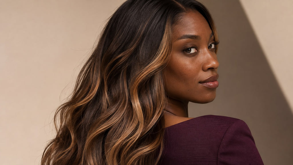
If your lengths already contain color or lightened sections, show them beside your natural roots. A foil-highlight reference may suggest near-root brightness, but the existing lengths still need their own assessment. For a painted look, ask how much contrast can be created while keeping the deeper sections you value. For either direction, let a colorist explain what is achievable from the actual base instead of choosing a formula from a reference photo. For shade choices beyond this placement decision, see Balayage by Skin Tone, Starting Base, and Contrast.
Plan Regrowth and Color Upkeep
Watch the root boundary and the lighter sections as separate changes. In a painted reference, the deeper root may keep the transition less obvious as hair grows, while the reflection through the lengths can still shift from the original photo. In a foil-highlight reference, repeated lighter pieces closer to the scalp can make returning roots easier to notice. Neither description sets an appointment schedule. Compare the result in your usual part, texture, and everyday light, then decide which visible change would prompt you to seek a refresh.
| Direction | Everyday check | Change to watch | Salon question |
|---|---|---|---|
| Painted balayage | Do lighter lengths still read in your usual styling? | Reflection through the lengths or a lower-looking placement | Which painted sections would you revisit? |
| Foil highlights | Do the repeated ribbons suit your usual part? | A clearer difference between new roots and near-root lightness | How much root contrast do you want to retain? |
| Combined approach | Do the bright focal zones and softer lengths still work together? | Different root and tone changes in different zones | Which zone deserves attention first? |
Your tolerance for those changes, daily styling, and willingness to revisit the salon can filter the shortlist. Technique names alone cannot tell you the time, cost, or condition of the finished result.
Build Your Color Reference
Save one neutral-light photo of your current roots and lengths, then choose a back-three-quarter reference that shows where lighter sections begin. Add a front or part-line view if that area matters to you. Compare images at similar exposure rather than treating a brighter photograph as evidence of a better technique.
You can bring this request: “I want to compare painted balayage with foil highlights. My reference is a back-three-quarter view of brunette hair with deliberate lighter placement. Keep the natural density and show me the difference in depth, reflection, and placement before we choose a service. I prefer a softer visible root through the back, but I’m open to selected brightness near the part. Please tell me which sections of my current hair can support that plan.”
Choose the reference that best expresses your desired placement and root visibility, then discuss achievable brightness with your colorist. Bring the current-hair photo alongside your preferred placement reference so the differences are easy to point out.
Frequently Asked Questions
How do I compare these shades at a similar depth?
Photograph them under the same light and white balance. First compare how light or dark the hair appears; then hold that depth roughly steady while comparing the visible reflection and placement. Wella’s chart distinguishes depth from tone within its own shade system. Use the distinction to describe what you see, rather than applying its codes to every brand.
Does my starting color change the achievable result?
Yes. Your natural roots and any previously colored lengths are part of the starting point. A painted balayage reference with a deep root and a foil-highlight reference with lightness near the scalp may call for different placement on your current hair. Show your colorist the full color history and ask what can be achieved now.
Will a reference photo show my exact result?
No. Use a photo to show the depth, reflection, and placement you prefer, then compare it with your current hair in similar light. Your colorist can assess your color history and explain what is achievable. Neither “balayage” nor “highlights” fixes damage, price, visit frequency, or outcome in advance.