
Balayage by Skin Tone, Starting Base, and Contrast: A Practical Comparison
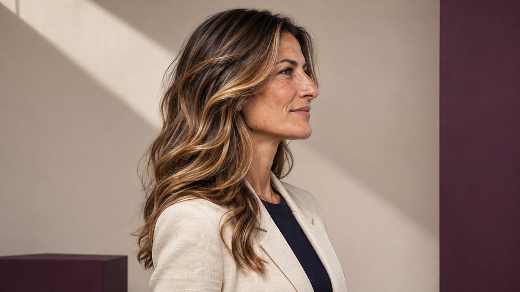
Choose highlight reflection and contrast with your starting base and preferred effect in mind. Compare subtle brunette balayage, beige dimension, warm caramel, and copper placement. Use the result as a direction to discuss with a colorist; your starting base and color history affect what is achievable.

Read the Color Direction Before Choosing a Look
Start with the effect you want to see in your hair. A brunette base can remain visible between caramel ribbons. You can ask for a similar separation, a softer beige reflection, or a stronger copper accent without treating any one of those looks as a rule for your skin tone.
Depth describes how light or dark a color appears; tone describes its reflected color direction. Wella’s hair color chart uses the number before the stroke for depth and the number after it for tone. That is Wella’s named numbering system, not a universal code or a prediction of your result. When you compare references, keep the visible depth and lighting similar so that you can judge the reflection itself.
Skin tone is one useful reference, but it does not decide the technique, starting base, color history, or your preference. A subtle brunette result keeps more of the brown base in view; beige dimension puts a different reflection into selected sections. Neither is a ranking of which complexion looks better. Save two references with a similar starting depth, then name the difference you actually prefer.
Compare Subtle Brunette Balayage, Beige Dimension, Warm Caramel, and Copper Placement
The four directions below are editorial examples, not shade formulas. Compare the depth of the base, the reflected color of the lighter sections, and where those sections sit. Hold the face, exposure, and white balance steady when you compare pictures; a brighter photograph can make a color appear lighter than it is.
| Direction | Starting depth | Reflection | Placement to compare |
|---|---|---|---|
| Subtle brunette balayage | Brown base stays visible | Muted brown ribbons close to the base | Fine, separated sections through the lengths |
| Beige dimension | Visible brunette base remains | Balanced beige in selected sections | Look for where the beige begins and how much base shows between pieces |
| Warm caramel | Compare at similar brunette depth | Brown-gold caramel warmth | Check ribbon width and how much light reaches the front |
| Copper placement | Keep the starting base in view | Visible orange-red copper | Choose whether copper appears in a few sections or across more of the surface |
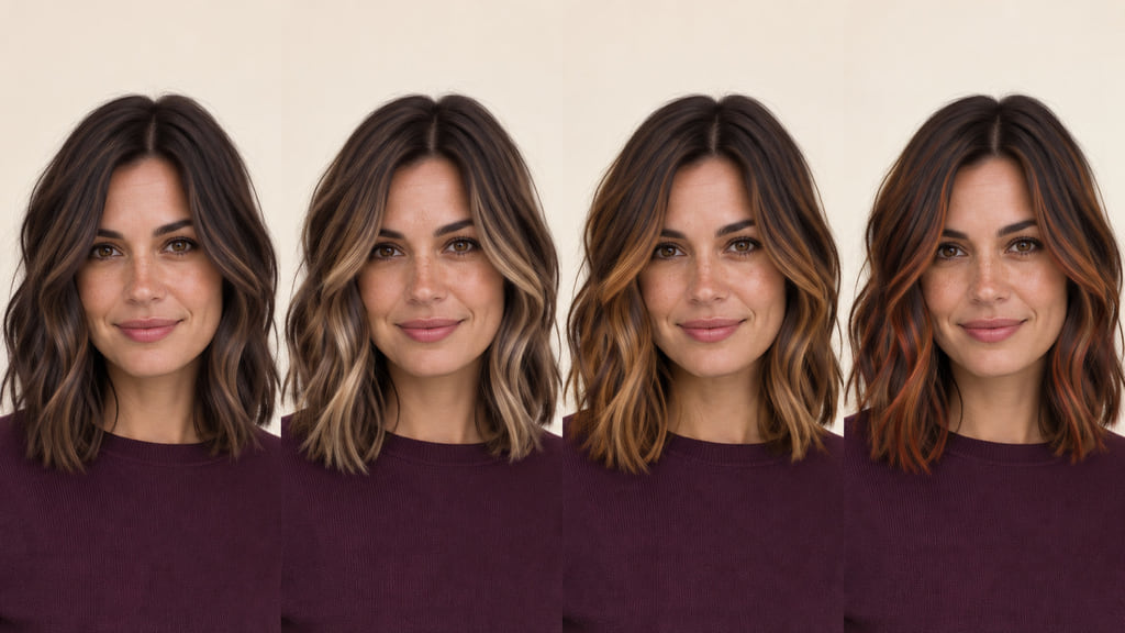
For a first shortlist, put subtle brunette balayage beside beige dimension. In the first, ask to retain a brown base with narrow ribbons at a similar depth. In the second, ask for a balanced beige reflection only in selected sections. You can then decide whether the difference you want is primarily reflection or the amount of visible lightness.
Subtle Brunette Balayage
This direction keeps brown hair visibly brown while fine lighter ribbons add separation through the lengths. In the first comparison view, notice the dark space between the pieces. Ask your colorist which sections could change while the base and overall depth remain recognizable. The example is a visual choice, not a claim that it suits every starting point.
Beige Dimension
The second view keeps a brunette base and shifts selected pieces toward beige. Compare it with the subtle brunette view at the same exposure: the question is whether you prefer the cooler, lighter-looking reflection or the quieter brown one. Point to the place where you want the beige to begin, and ask how much of your base can remain visible.
Warm Caramel
The third view brings a brown-gold reflection into separated ribbons. Compare its warmth at a similar depth to the beige example rather than comparing two photographs with different lighting. If you like the caramel near your face but want less change through the back, show both areas in your reference and discuss their placement separately.
Copper Placement
The fourth view shows orange-red copper in selected sections over a visible brunette base. Decide whether that color should read as a small accent or a broader surface change. Ask to compare the same placement in neutral light before choosing how much copper you want.
Account for Your Starting Base
Bring a photo of your own hair in neutral light, including the roots and ends, plus a record of previous color. A natural brunette base with uncolored lengths is a different canvas from hair with old lightened pieces or darker artificial color. Wella’s starting-point guidance treats hair history and underlying pigment as inputs to a color result. Your colorist can assess what part of a subtle brunette reference is realistic for your hair without treating the image as a guarantee.
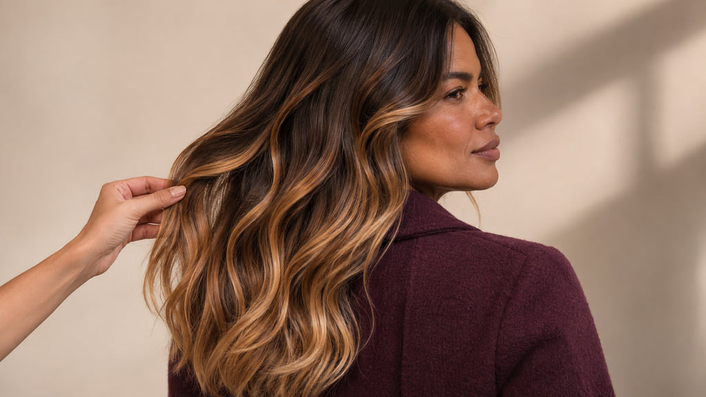
If beige dimension is your preference but your current lengths are darker than the reference, keep the beige reflection and selected placement as your goal. Ask what depth is possible from your base and history, and whether the first service would look different from the photo. If you are still choosing a method, compare Balayage vs. Highlights to see how the placement differs.
Plan Regrowth and Color Upkeep
Notice what you would want to preserve as the hair grows: the dark space between subtle ribbons, the beige reflection, the warmth of caramel, or the limited area of copper. A low, diffused start may let more of your natural root remain visible; a brighter section close to the face may make a change at the root more noticeable. Watch your own color and usual part instead of following a fixed refresh interval.
| Direction | Daily check | Change to watch | Salon support to discuss |
|---|---|---|---|
| Subtle brunette | Can you still see the fine ribbons in your usual style? | Separation or reflection becomes less clear | Whether the existing pieces need a tonal refresh or new placement |
| Beige dimension | Does beige remain distinct from the brown base? | Reflection shifts away from the beige you chose | How to maintain that reflection on your starting hair |
| Warm caramel | Is the warmth as visible as you want near the face? | Color or contrast changes as the sections grow | Whether placement or tone needs attention first |
| Copper placement | Are the copper sections still where you want them? | The accent changes in color or stands out more than intended | How much accent to preserve at a future appointment |
Choose the direction whose visible changes you are willing to monitor and discuss. There is no single upkeep schedule or cost that follows from the shade name alone.
Build Your Color Reference
Save one image that shows the full root-to-end pattern and another close view of the placement. Add a photo of your own hair taken in similar neutral light. A portrait alone may show reflection but hide where the lighter sections begin; the detail view answers that placement question.
Here is a salon brief you can adapt: “I want to compare subtle brunette balayage with beige dimension. My reference is brunette balayage with visibly separated caramel ribbons. Keep the natural density and show me the difference in depth, reflection, and placement before we choose a service. My current color history is [your history], and the lightest area I would consider is [your limit].” Ask your colorist which parts of the reference fit your starting point and which would need adjustment.
If you want to test the broad visual direction first, you can preview a color direction. Treat that view as a comparison aid, then bring the images and your completed brief to a consultation. It cannot show the chemical result on your hair.
Frequently Asked Questions
Does a warm skin tone require caramel balayage?
No. Warm caramel is one visible reflection to compare with beige or subtle brunette ribbons at a similar depth. Your preferred contrast, base, history, and placement matter alongside skin tone.
What if I have a neutral skin tone?
Compare a balanced beige with a quieter brunette and a warmer caramel reference in similar light. Look at the relationship among hair, skin, brows, and eyes, then keep the direction you prefer rather than treating “neutral” as a single prescribed shade.
Can a reference photo tell me how light my balayage can get?
No. It shows a visual goal. Your natural depth, previous color, and condition of the lengths are part of the colorist’s assessment, so bring both the reference and your color history.