
Hair Colors for Dark Skin: Depth, Reflection, and Choice

Compare espresso, caramel ribbons, copper, and deep red-violet by depth and placement while keeping your own undertone and preferences in view. Use the result as a direction to discuss with a colorist; your starting base and color history affect what is achievable.

Start with the depth you want to keep, then decide where a different reflection should appear. A deep espresso coily bob with a restrained warm accent is one reference; selected caramel ribbons are another. Copper and deep red-violet offer different reflections at a similar depth. These are directions to compare, not one palette prescribed for everyone with dark skin.
Read the Color Direction Before Choosing a Look
Depth describes how light or dark hair appears. Reflection is the color you notice within that depth. In Wella’s color chart, the number before the stroke indicates depth and the number after it indicates tone. That numbering belongs to Wella’s system; a photograph and a plain-language description are more useful than assuming every brand shares it.
Espresso keeps a deep brown base, while caramel ribbons place brown-gold light in selected coils. One changes the overall dark impression; the other changes where brightness sits. Your skin undertone can inform a comparison, but it cannot assign you a required shade. Compare references in the same light and choose the effect you prefer; lighter hair is not automatically a better match.
Compare Espresso, Caramel Ribbons, and Copper
The four directions below show different choices for a similar starting look. Hold the face, exposure, and white balance steady when comparing reflection. If one option is lighter overall, name that depth difference separately from its color direction.
| Direction | Depth and reflection | Placement to discuss | Keep steady while comparing |
|---|---|---|---|
| Espresso | Deep brown base with visible strand detail. | Whether a restrained accent belongs near the face or through the ends. | Light and hair outline. |
| Caramel ribbons | Brown-gold reflection in selected sections; the deep base remains visible. | Which coils carry brightness and how much natural depth stays between them. | Face, exposure, and starting base. |
| Copper | Orange-red reflection at a comparable depth. | All-over reflection or a few visible sections. | Depth and white balance. |
| Deep red-violet | Deep red-violet reflection with visible red and dark strand detail. | Where the reflection should show in daylight. | Depth, exposure, and hair outline. |
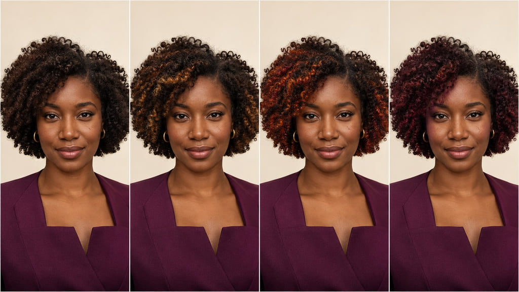
Compare two starting options: espresso keeps a deep brown base with detail still visible in the darker coils; caramel ribbons add selected brown-gold sections against that base. Ask whether you want a change across the whole bob or brightness placed in a few sections. The distinction is what you want to see and maintain.
Espresso
This example keeps the coily bob deep brown without letting the darker areas turn into a single flat shape. Compare it with another deep reference at the same exposure so the difference in reflection is visible. Ask your colorist which part of the depth should change, which should stay, and how the strand detail will read in your usual light.
Caramel Ribbons
Here brown-gold reflection appears in selected coils while the base remains visible between them. Look at the placement on hair worn the way you usually wear yours. Ask which sections will carry the change and how much of your present depth can remain; the photograph is a placement reference, not a promise that your base will produce the same color.
Copper
In this example, an orange-red reflection is the visible change. Compare copper with another option at a similar depth and fixed white balance so a brighter photograph does not decide for you. Ask whether you want the reflection throughout the bob or only in sections that catch the light.
Deep Red-Violet
This direction keeps a deep overall impression while adding a red-violet reflection with visible red. Preserve enough light in the reference to see individual strands. Compare it with espresso at similar depth, then ask where you want that reflection to appear indoors and in daylight.
Account for Your Starting Base
Show your colorist your natural roots, any previously colored lengths, and the ends. Also name the length and density you want to keep. An espresso reference may be closer to a deep starting base, but a photograph cannot tell you which service will create its reflection on your hair. A shade number from Wella’s chart describes that brand’s depth and tone; it does not settle your individual formula.
Caramel ribbons raise another question: can selected sections reach the brown-gold direction you want while the rest of your base stays visible? If your current color or routine differs from the reference, ask for a version with narrower or fewer ribbons. Your own preference remains the deciding factor.
Plan Regrowth and Color Upkeep
For espresso, notice when the reflection looks flatter than you want or the visible depth no longer matches your reference. For caramel ribbons, watch where new roots interrupt the placement and whether the selected sections still read brown-gold in your usual light. Bring both observations to your next consultation rather than following a fixed interval from someone else’s hair.
| Direction | Daily attention | Change to watch | Salon support to discuss |
|---|---|---|---|
| Espresso | Check that your usual styling leaves dark strand detail visible. | Reflection looks less distinct or new growth changes the overall depth. | Whether a reflection refresh fits the existing base. |
| Caramel ribbons | Notice where the bright sections sit in your usual curl pattern. | Root transition or selected ribbons no longer match the reference. | How to refresh placement while retaining depth. |
| Copper | Compare the warm reflection in consistent light. | The orange-red direction looks different from the intended reference. | Whether and how to refresh that reflection. |
| Deep red-violet | Check both indoor and daylight appearance. | The visible red reflection becomes too faint or shifts. | Which sections need a color refresh. |
Build Your Color Reference
Save one photograph that shows the full coily bob and its deep base. Add a second view in neutral light that shows where the warmer sections sit. A useful salon brief is: “I want to compare espresso with caramel ribbons. My reference is a deep espresso coily bob with a restrained warm accent. Keep my natural density and show me the difference in depth, reflection, and placement before we choose a service.”
Choose the direction you want to see, then discuss the reference against your starting base and color history. A colorist can help separate the look you want from the service your hair may need.
Frequently Asked Questions
How do I compare these shades at a similar depth?
Use photographs with the same light, exposure, and hair outline. Compare espresso with deep red-violet to focus on reflection; when comparing espresso with caramel ribbons, also note where selected brightness changes the placement. Wella’s chart separates depth from tone in its own numbering system, but you can make the same distinction in ordinary words.
Does my starting color change the achievable result?
Yes. Natural roots, previous color, and the condition of the lengths all matter to a colorist’s plan. An espresso reference and caramel ribbons may call for different changes on your current base. Bring your color history and ask what is realistic before choosing a service.
Can a reference photo predict the dye result?
No. A photo can show the color direction and placement you prefer, but it cannot show how your hair will process. Bring the reference to a colorist and discuss what your starting base can support.