
Hair Colors for Tan Skin: Depth, Reflection, and Choice

Compare caramel brunette, honey dimension, soft copper, and mocha against your current skin appearance without treating a tan as a season. Use the result as a direction to discuss with a colorist; your starting base and color history affect what is achievable.

Read the Color Direction Before Choosing a Look
Picture mocha wavy hair with restrained honey brightness: the brown remains the main color, while selected pieces catch more light. That gives you a useful way to compare hair colors for tan skin. Decide how light or dark you want the hair to appear, then decide whether the color reflection should look golden, copper, or more neutral.
A tan changes surface appearance, not a reliable standalone undertone diagnosis. Caramel brunette changes the warmth you see across a brown base; honey dimension puts more of that warmth into selected sections. These are editorial directions to test against your current appearance, not rules about which color belongs to a skin category. For a consistent comparison, use similar framing, exposure, and white balance.
Compare Caramel Brunette, Honey Dimension, and Soft Copper
Depth is how light or dark the hair appears; tone is its visible color direction. In Wella’s hair-color chart guide, the number before the stroke indicates depth and the number after it indicates tone. That notation belongs to the cited Wella system, not every color brand. Use the same practical separation when you compare these four editorial examples.
| Direction | Depth and reflection | Placement to compare | Question for your colorist |
|---|---|---|---|
| Caramel brunette | Brown base with a brown-gold caramel reflection | Reflection through the brown field or concentrated near the face | Can we keep the brown depth while changing the reflection? |
| Honey dimension | Visible brown base with restrained honey-gold brightness | Selected sections rather than uniform lightness | Where would the brighter sections be most visible? |
| Soft copper | Comparable depth with a restrained orange-red reflection | Copper throughout or in selected lengths | How visible can the copper be on my starting base? |
| Mocha | Brown depth with a restrained neutral reflection | Broad brown field or subtle variation through the waves | Can we retain depth and still see movement? |
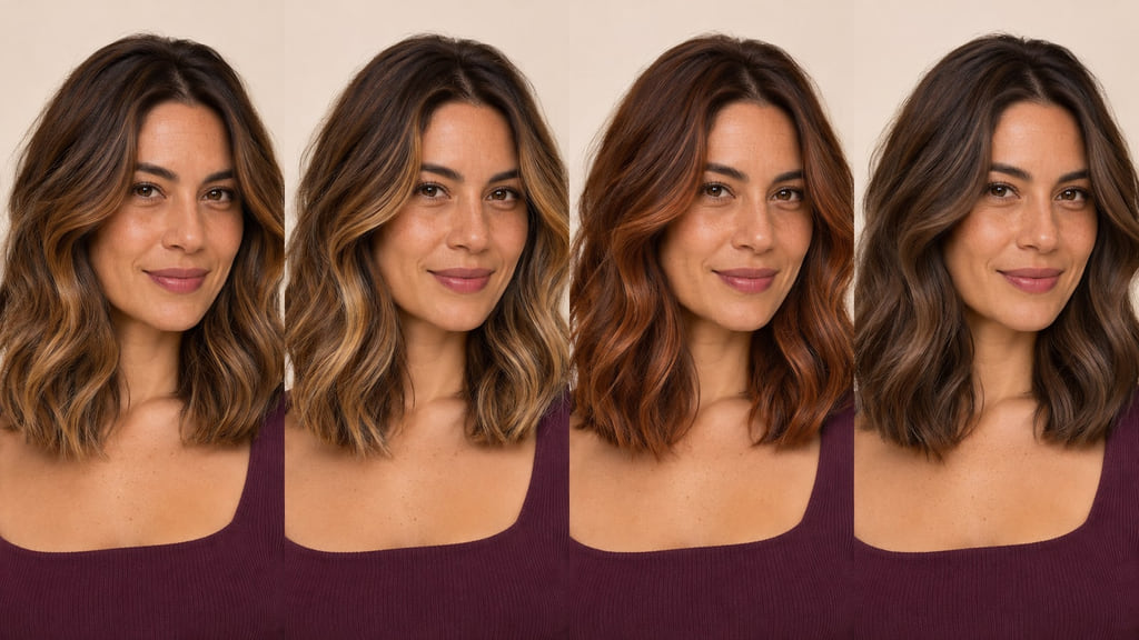
For example, compare caramel brunette with honey dimension before deciding how much brightness you want. The first keeps a brown-gold reflection across the brown base; the second retains that base but makes selected honey-gold sections more visible. If depth also changes between two references, you may be responding to the light–dark contrast rather than the reflection alone.
Caramel Brunette
This example shows brown-gold caramel reflection over a brown base. Keep depth and white balance similar in two photographs when deciding how much gold you want to see. Ask which part of your current brown should stay, and whether warmth belongs throughout the hair or in one visible area. The reference names an effect; it does not establish a universal match.
Honey Dimension
This example keeps the brown base visible and places restrained honey-gold brightness in selected sections. Compare it with caramel brunette at a similar overall depth so placement becomes the main difference. Ask where the brighter sections would sit on your own cut and how they would meet your natural root.
Soft Copper
Soft copper adds a visible orange-red reflection without requiring the color to become much lighter. Compare a restrained copper reference with a brown direction under the same light; a warm camera setting can make both appear more copper than they are. Ask whether you want that reflection across the hair or mainly through the lengths.
Mocha
Mocha is a restrained neutral-brown direction in this comparison. Keep the reference at a similar depth to caramel brunette if you want to judge the difference in reflection. Ask whether a broad brown field gives you the outline you want, or whether small shifts through the waves would make the shape easier to read.
Account for Your Starting Base
Photograph your natural root, previously colored lengths, and ends in neutral light. A caramel brunette reference may show the depth you want while concealing how different your current color is. Tell your colorist about earlier color, the length you want to keep, and whether changing the reflection matters more to you than changing depth. Manufacturer shade numbers can clarify a discussion within that manufacturer’s system; they do not assess your hair.
If honey dimension is closer to your goal, show which sections you want brighter and which part of the base should remain visible. A photo of someone else’s hair cannot predict the result on your current base or color history. The fair-skin guide and medium-skin-tone guide address their own depth ranges.
Plan Regrowth and Color Upkeep
With caramel brunette, notice when the brown-gold reflection stops reading as clearly as you intended. With honey dimension, watch the transition between your natural root, brown base, and brighter sections. Bring photographs taken in your usual light to a follow-up conversation so you can discuss whether reflection or placement needs attention. The timing depends on your hair and chosen service.
| Direction | Routine to consider | Visible change to watch | Salon conversation |
|---|---|---|---|
| Caramel brunette | Check the brown-gold reflection in your usual light | Warmth becomes quieter or the root contrast changes | Refresh reflection or keep the present depth? |
| Honey dimension | Notice how selected pieces sit in your usual styling | Brightness shifts against the base or grow-out becomes more visible | Adjust placement or soften the transition? |
| Soft copper | Compare the orange-red reflection with your original reference | Copper appears softer or uneven to you | How much copper do you want to maintain? |
| Mocha | Check whether the waves still show brown variation | The neutral brown reads flatter or the root differs | Keep the depth or change the reflection? |
Choose the direction whose visible changes and salon support fit your routine. A lighter section and a full brown field can create different grow-out patterns even when their reference photos look close.
Build Your Color Reference
Save one photograph of your current roots and ends in neutral light. Add two references with similar framing: one showing the full hair outline and another showing where the reflection or brighter pieces sit. Mark the area you want to preserve as clearly as the area you want to change.
You can say: “I want to compare caramel brunette with honey dimension. My reference is mocha wavy hair with restrained honey brightness. Keep the natural density and show me the difference in depth, reflection, and placement before we choose a service.” This gives a colorist a specific comparison to assess, rather than a dye recipe or a request for identical hair.
Choose the closer direction around your current skin appearance and discuss it using those references. You can also preview a color direction as an optional visual step. A screen preview cannot diagnose undertone or predict the chemical color result.
Frequently Asked Questions
How do I compare these shades at a similar depth?
Use photographs with similar light, exposure, and framing, then first compare how light or dark the hair appears. Next compare the golden, copper, or neutral reflection. Wella’s chart distinguishes depth from tone in its own notation; your photographs should help you see that distinction, not supply a formula.
Does my starting color change the achievable result?
Yes. Your natural base and previously colored lengths are part of the starting point. Caramel brunette and honey dimension differ in where warmth and brightness appear, and a colorist can assess which changes are realistic for your hair while keeping the depth or length you want.
Can a virtual preview predict the dye result?
No. It helps you compare visible directions on a screen, but it cannot evaluate your color history or predict a service result. A tan changes surface appearance, not a reliable standalone undertone diagnosis; use the preview as a reference for a consultation.