
Brunette Balayage Ideas by Undertone and Starting Depth: A Practical Comparison

Choose how much brightness to place within your brunette base. Compare fine caramel ribbons, muted beige dimension, and a soft face frame at a similar starting depth, then show your colorist where you want the lighter pieces to begin. Your current color and color history shape what can be achieved.

Read the Color Direction Before Choosing a Look
The first decision is how much of your brunette base you want to see between lighter pieces. Fine caramel ribbons add warm separation without making every length light. Muted beige dimension changes the reflection more quietly. A soft face frame moves the emphasis toward the front even when the overall amount of lightness stays restrained. Choose the difference you want to notice, then mark where it starts in a reference photo.
Depth is how light or dark hair appears; tone is its color direction. In Wella’s hair color chart, the number before the stroke indicates depth and the number after it indicates tone. This is Wella’s numbering system, not a universal shade promise. A caramel and a beige reference can sit at a similar depth while their reflections look different. Compare both with the brunette root visible, in similar light, before choosing a direction.
Compare Fine Caramel Ribbons, Muted Beige Dimension, and a Soft Face Frame
These are editorial examples of visible choices, not formulas or predictions for a particular person. Keep the starting brunette depth similar across references. Then compare reflection, the width and position of lighter sections, and how much dark hair remains between them.
| Direction | Reflection and brightness | Placement | What to show your stylist |
|---|---|---|---|
| Fine caramel ribbons | Warm golden-brown lines with a modest difference from the brunette base | Narrow separated pieces through the midlengths and ends | How much dark space should remain between ribbons? |
| Muted beige dimension | Quieter, less golden reflection at a comparable depth | Softly dispersed pieces with a visible brunette root | Which beige reference has the depth you actually want? |
| Soft face frame | Front lightness reads more clearly even if the rest stays dark | Selected pieces near the face, blended into darker lengths | Where should the first lighter piece begin? |
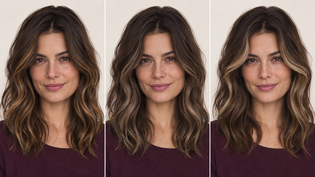
Look at the first and second views before deciding whether you want a warmer or quieter reflection. Then look at the third view to decide whether the front should carry more light than the rest. The image is a comparison aid; your own roots and ends remain the useful starting reference.
Fine Caramel Ribbons
Narrow caramel pieces let the brunette base remain continuous from root through much of the length. The warm reflection is visible where light catches individual waves, while darker gaps keep the result from reading as an all-over lighter color. If this is your direction, show a full-head reference and point out both the ribbon width and the dark space you want to retain. Ask how those pieces would appear with your usual part and texture.
Muted Beige Dimension
Here the visual change is mainly in reflection: the lighter sections read less golden while staying close to the same brunette depth. Compare the center panel with the caramel panel under the same light. If beige is your preference, save a reference that includes the root; a bright or cool photograph alone can make the color appear lighter or ashier than you intend. Ask your colorist what beige direction is realistic from your current base.
Soft Face Frame
The right panel places a clearer lighter section near the face. That section can draw more attention than scattered ribbons even when the rest of the hair remains brunette. Decide whether you want the front piece to begin near the root or lower through the length, and whether it should stand apart or blend into nearby strands. Point to that exact starting place in your reference rather than relying on the name “face frame.”
Account for Your Starting Base
Bring a current photo that shows your roots, midlengths, and ends in neutral light. Natural brunette hair, previously lightened ends, and darker artificial color can lead to different routes toward the same picture. Wella’s starting-point guidance asks colorists to consider hair history and underlying pigment alongside the target shade. It does not establish an achievable result for your hair from a photo alone.
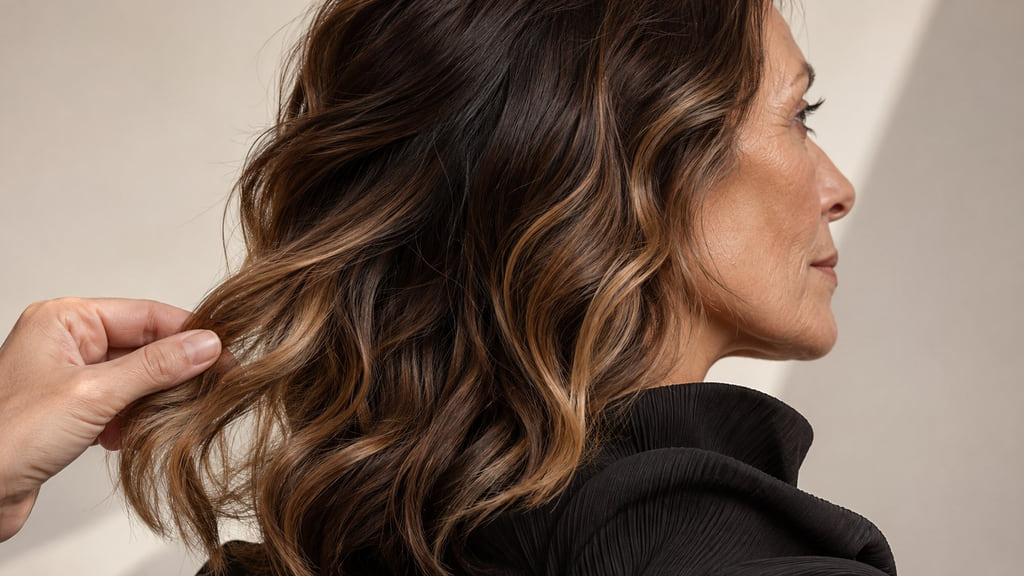
If you have older color through the ends, tell your colorist before choosing the lightest reference. Ask what depth and reflection can be reached while keeping the brunette base visible. For the service distinction, see Balayage vs. Highlights. To compare placement across more starting colors, read Balayage by Skin Tone, Starting Base, and Contrast; for a much lighter base, see Blonde Balayage Ideas by Undertone, Base, and Contrast.
Plan Regrowth and Color Upkeep
Watch placement and reflection separately. As roots grow, a piece that begins close to your part may become more noticeable than a lower ribbon. The caramel or beige reflection can also change while the placement still suits you. Wella’s balayage guide identifies placement, hair growth, home care, and toner as variables in upkeep; it does not give a single schedule for every head of hair.
If you prefer a quiet grow-out, show how much dark root you want visible and ask how the first lighter pieces will sit as it grows. If the color direction changes before the placement bothers you, ask whether a tone refresh would address your concern. If the front section becomes too prominent, ask about changing its placement or contrast. Choose the version whose visible changes and salon visits fit your routine, rather than treating “low maintenance” as a fixed property of balayage.
Build Your Color Reference
Save a full view with the brunette root and ends in frame, plus a close view of the exact ribbon width or front starting point. Add a current photo of your own hair in similar light. That gives your colorist three things to compare: starting depth, desired reflection, and placement.
You can adapt this filled salon brief: “I want to compare fine caramel ribbons with muted beige dimension. My reference is medium brunette waves with narrow caramel ribbons. Keep my natural density in view, and show me the difference in depth, reflection, and placement before we choose a service. My current color history is [your history]. I want the lightest pieces to begin [your preferred area], and I want to keep [amount of brunette base] visible.” Reference photos are comparison material, not a guarantee of the dye result.
Choose one direction and bring both the full view and placement detail to a consultation. Point to the sections you want to keep dark and the exact place where the lighter pieces should begin.
Frequently Asked Questions
How do I compare these shades at a similar depth?
Use photos with similar brunette roots, exposure, and white balance. Then compare caramel warmth with muted beige reflection without letting a brighter photograph decide for you. Depth and tone are separate coordinates in Wella’s chart, but a number from that system is not a cross-brand or personal result guarantee.
Does my starting color change the achievable result?
Yes. A medium brunette root with untouched lengths differs from similar-looking hair that has been colored or lightened before. Show your current roots and ends and describe your color history. Ask which part of the caramel, beige, or face-frame reference is realistic from that starting point.
How much brunette should remain visible?
Decide whether you want the brunette base to remain dominant at the roots, through the interior, and at the ends. Fine ribbons leave more dark space between lighter pieces; a brighter face frame concentrates the change at the front. Show your colorist the dark areas in your reference as clearly as the light ones.