
Summer Hair Colors: A Practical Comparison

Compare the light, cool, and soft Summer directions before choosing a subtype guide. Keep your starting base in view, and treat the closest direction as a reference to discuss with a colorist rather than a promised result.

Compare Light Summer, Cool Summer, and Soft Summer before choosing a subtype guide. A light-brown lob can move toward lighter depth, cooler reflection, or softer color clarity without those being the same decision. Bring the closest two references to a colorist; your starting base and color history affect what is achievable.
Read the Color Direction Before Choosing a Look
Begin with the visible change you want. In a soft neutral-cool light-brown lob, a lighter overall field draws attention to depth, while a cooler version of the same brown changes its reflection. Depth is how light or dark the hair appears; reflection is the tone visible within it. Wella’s color chart distinguishes these with the number before and after the stroke in its own system. Its numbering is a useful example, not a code shared by every brand.
The Concept Wardrobe’s twelve-season framework places Summer alongside Spring, Autumn, and Winter. Use that attributed palette model to compare styling directions, not to diagnose yourself or require a new hair color. Palette-family Summer is separate from calendar summer fashion forecasts. Light Summer and Cool Summer offer different reference decisions; neither is a ranking of how someone looks.
Compare Light Summer, Cool Summer, Soft Summer
Keep the face, camera exposure, and hair outline consistent when comparing photographs. Then change one visible variable at a time. Use the table to compare visible effects, rather than treating a palette label as a required hair shade.
| Direction | What to foreground | Placement to compare | Starting-base question |
|---|---|---|---|
| Light Summer | Lighter depth with a soft neutral-cool reflection | Overall lightness versus selected lighter pieces | How much of your current depth do you want to keep? |
| Cool Summer | Cool reflection at a comparable depth | Even cool tone versus quiet dimension | Can the existing lengths support the reflection in your reference? |
| Soft Summer | Muted color clarity and gentle contrast | Diffused pieces versus a distinct bright face frame | Which existing sections already have the softness you want? |
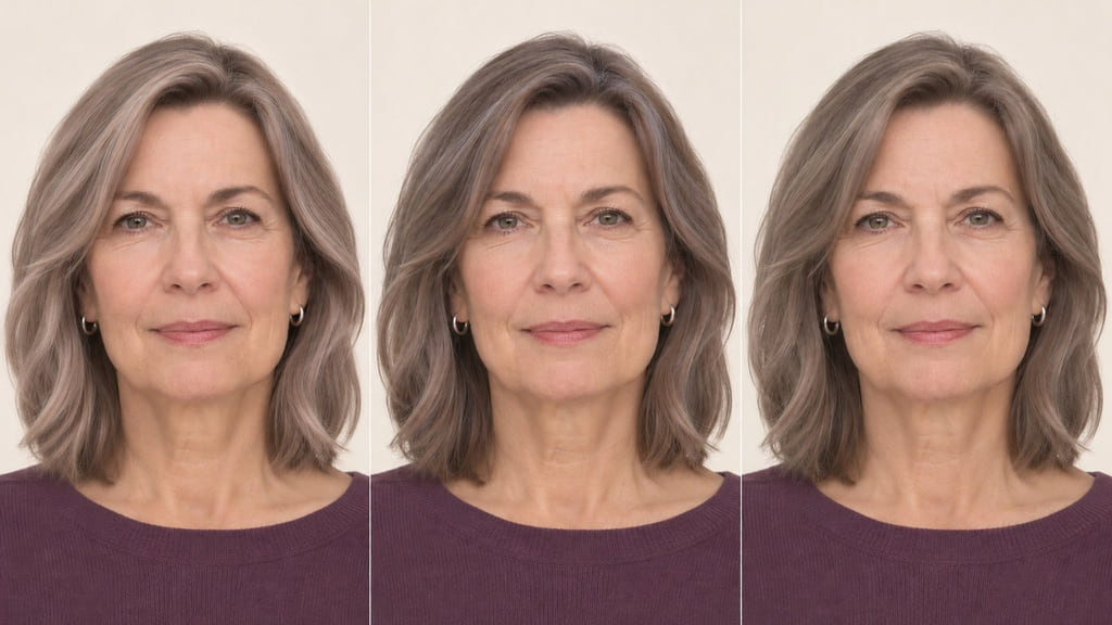
For an A/B choice, put a lighter Light Summer reference beside a Cool Summer reference with a similar face and exposure. Ask whether you respond to the lighter field or the cooler reflection. If the difference disappears when the photos use the same light, compare a softer, lower-contrast Soft Summer reference before picking a subtype.
Light Summer
For a Light Summer example, foreground lighter depth rather than assuming everyone needs blonde hair. On the light-brown lob, you might compare a lighter overall field with a few carefully placed brighter pieces while keeping the same cool-neutral reflection. Ask which part needs to become lighter and which part of your natural depth should stay. The Light Summer guide explores that separate choice.
Cool Summer
For a Cool Summer example, keep the approximate brown depth and compare a more noticeably cool reflection. If one reference is also much lighter, you cannot tell which change you prefer. Ask the colorist whether the roots, lengths, or selected sections need a tonal change and what your color history allows. The Cool Summer guide examines that direction in more detail.
Soft Summer
For a Soft Summer example, compare a quieter, more muted effect with a brighter or more sharply divided placement. Keep the depth and lighting close so the visible difference is softness rather than a darker photograph. Ask where you want less contrast and which sections should keep their present color; a palette name alone does not decide the shade.
Account for Your Starting Base
Look at your natural roots, previously colored lengths, and ends before matching a reference. A Light Summer photograph may have the depth you like, but it cannot show what your own hair can reach or how the reflection will appear on it. Keep your desired length and density visible in the reference too. The swatches below separate depth from reflection and color clarity; they are not a manufacturer’s level chart.
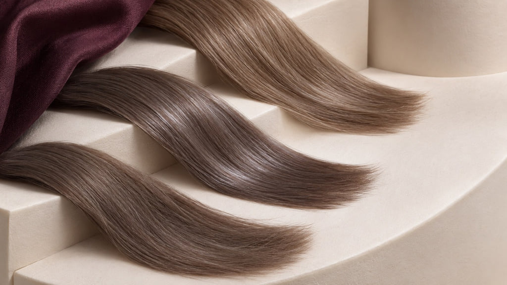
If your current hair is deeper or already colored, a Cool Summer reference at a similar depth may be a more useful first comparison than a lighter one. Discuss whether your goal is a change in reflection, a different placement, or a larger depth change. Wella’s depth-and-tone explanation supplies vocabulary for that conversation, not a universal formula. For the wider framework and neighboring families, see Seasonal Hair Color Analysis, Spring Hair Colors, and Autumn Hair Colors.
Plan Regrowth and Color Upkeep
For a lighter Light Summer direction, look at where brightness starts: pieces close to the root can make new growth more noticeable than brightness kept farther down. For a Cool Summer direction, watch whether the reflection still reads cool in ordinary light as the color changes. A Soft Summer reference may depend on diffuse placement, so notice if the sections begin to look more sharply separated than you wanted. These are cues for a salon conversation, not a fixed appointment schedule.
| Direction | Daily observation | Regrowth or fading to watch | Salon conversation |
|---|---|---|---|
| Light Summer | Does the lighter field still look balanced in your usual light? | Contrast between natural roots and brighter sections | Would a different placement better fit your routine? |
| Cool Summer | Does the reflection still read cool at the depth you chose? | A visible shift in tone or root-to-length contrast | Which area needs attention, if any? |
| Soft Summer | Do the sections still read as a quiet whole? | Brighter pieces becoming more distinct | Would you keep the same placement next time? |
Your tolerance for daily checking, visible roots, and salon support matters more than a universal interval. Save a current photo when you like the effect and another when you want a change. If you use dye, follow the exact product directions and skin-test instructions; the FDA’s hair dye guidance explains these safety steps.
Build Your Color Reference
Save one unfiltered photograph of your current hair in neutral light, including roots and ends. Add a front or three-quarter view of the preferred direction and, if placement matters, a side or back view. Keep the exposure similar. Mark the area you want to keep and the one change you want to discuss.
You can say: “I want to compare Light Summer with Cool Summer. My reference is a soft neutral-cool light-brown lob. Keep the natural density and show me the difference in depth, reflection, and placement before we choose a service.” That is a comparison brief, not a chemical recipe or a promise that a photo predicts your result.
Choose the closest direction, then take both references to a consultation before choosing a subtype guide. You can also preview a color direction as an optional visual check. A screen preview cannot diagnose a palette or predict lift, fading, or the exact salon result.
Frequently Asked Questions
Is this a diagnosis or a styling framework?
It is a styling framework. The Concept Wardrobe names Summer as one of four families in its twelve-season model; Wella’s chart explains depth and tone within its own numbering system. Neither source can diagnose your individual palette or determine a dye formula from a photograph.
Do I need to dye my hair to fit a palette?
No. Your natural hair can be the starting reference. Compare a lighter Light Summer example with a same-depth, cooler Cool Summer example only if you want to explore a visible change. A palette label does not require a service.
How can I compare depth and reflection?
Use the same light and similar framing. First compare how light or dark the hair appears, then compare the tonal reflection at a similar depth. Keep palette-family Summer separate from calendar summer fashion forecasts, and discuss your closest two references with a colorist.