
Seasonal Hair Color Analysis: A Practical Comparison
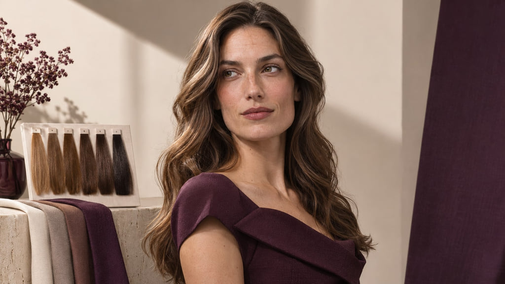
Use Spring, Summer, Autumn, and Winter as comparison aids for hair color, then choose the next guide that answers your specific question. Compare depth, reflection, and placement in consistent light. Your starting base and color history shape what a colorist can achieve.

Read the Color Direction Before Choosing a Look
If a seasonal label helps you describe a color preference, use it to narrow the comparison, then name the visible change you want. In The Concept Wardrobe’s twelve-season framework, Spring, Summer, Autumn, and Winter are four named families. The swatches beside the portrait show why a label alone is less useful than a reference that makes hair depth and reflection visible.
Different frameworks draw their boundaries differently. A Spring reference might lead you toward clearer warmth; a Summer reference might lead you toward cooler softness. Those are editorial directions to compare, not a scientific diagnosis, a universal taxonomy, or a rule that you must dye your hair. Keep the lighting and apparent depth steady before deciding which difference you actually prefer.
Compare Spring, Summer, Autumn, and Winter
Start with one pair, such as Spring versus Summer, and look at reflection and clarity separately. Then ask whether the lightness you like is actually present in both references. This table gives each family a different question for a consultation; it does not assign a shade to every person in that family.
| Direction | Depth and reflection to compare | Placement to notice | Next question |
|---|---|---|---|
| Spring | Warmth and relatively clear color at a chosen depth | Is the warmth throughout or concentrated near the face? | Which of Light, Warm, or Bright Spring is the useful next comparison? |
| Summer | Cooler, softer reflection; lightness and mutedness are separate choices | Does softness extend through the lengths or sit in selected sections? | Do you want a lighter result or a quieter reflection? |
| Autumn | Warmer, more muted reflection; compare saturation at the same depth | Where does the warm reflection remain visible? | How much existing depth should stay? |
| Winter | Cooler, clearer reflection; compare darkness apart from clarity | Where is the strongest contrast placed? | Could your preferred clarity work without going darker? |
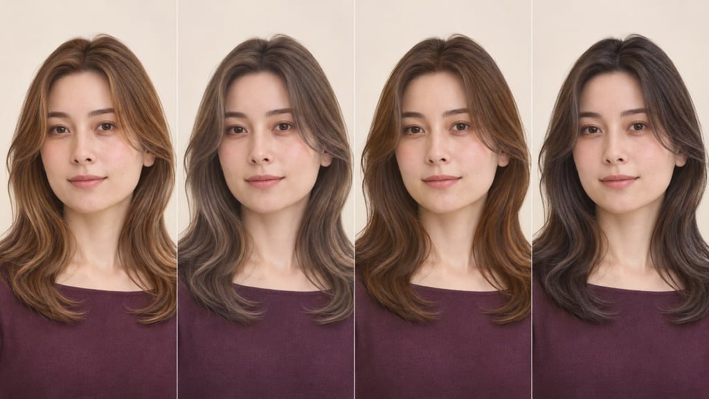
For example, compare the first two panels without declaring a winner. Spring shows a warmer, clearer reflection, while Summer shows a cooler, softer one at a similar apparent depth. Save both if that difference is the decision you need to discuss.
Spring
Look at the warmth and clarity in the first panel before naming a blonde or brunette shade. Hold the face, exposure, cut, and apparent depth steady when you compare another reference. Ask your colorist where a warmer reflection could appear while keeping the parts of your current color that you like. The Spring label can route you toward Light, Warm/True, or Bright Spring; it does not prescribe one blonde.
If warm reflection is the part you want to examine, compare the examples in Warm Spring Hair Colors.
Summer
The second panel softens the reflection without simply making the hair lighter. Compare it with Spring at a similar depth to separate coolness from softness. Ask whether you want the quieter reflection throughout the hair or only in selected sections, and what would remain from your current base.
Compare Light Summer Hair Colors for a lighter field with Soft Summer Hair Colors for a quieter overall effect.
Autumn
The third panel illustrates a warmer, more muted direction. Compare it with Spring to see the difference between warmth and clarity, then make a separate decision about lightness. Ask which sections could keep their current depth if a warmer reflection becomes the focus.
Use Soft Autumn Hair Colors, Warm Autumn Hair Colors, and Deep Autumn Hair Colors to compare softness, warmth, and depth as separate choices.
Winter
The fourth panel illustrates a cooler, clearer direction. Compare it with Summer before assuming Winter means black hair: clarity and darkness are different variables. Ask which areas should carry stronger contrast and whether the depth you already have can remain.
Compare Deep Winter Hair Colors with Cool Winter Hair Colors to see whether depth or cooler reflection is doing more of the work in your reference.
Account for Your Starting Base
Your natural base, previous color, and the condition and length of your hair affect the route to any reference. Depth is how light or dark the hair appears; tone is its color direction. Wella’s hair color chart uses the number before the stroke for depth and the number after it for tone. That notation belongs to Wella’s system, not to every brand.
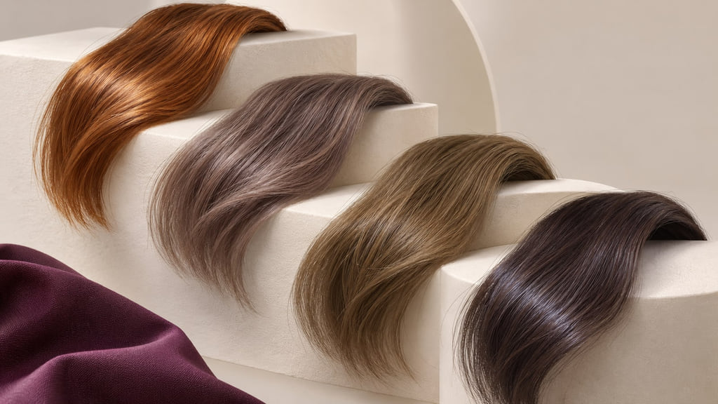
If a Spring reference is lighter than your current hair, ask what portion of the look depends on lightness and what portion depends on reflection. If a Summer reference is softer than your current color, ask whether a change in reflection is possible without copying the photo’s depth. Bring a current photo in neutral light and tell your colorist about prior color services. For a closer family comparison, open Spring Hair Colors or Autumn Hair Colors.
Plan Regrowth and Color Upkeep
Look at where a new color would meet your natural roots, where a reflection might become less visible, and which sections you would want to refresh. A clear warm reference and a soft cool reference can ask for different kinds of upkeep even at the same depth. Ask your colorist how the proposed placement would change on your hair; a photograph cannot set a universal service interval.
| Direction | Daily routine | Change to watch | Salon support to discuss |
|---|---|---|---|
| Spring | How much visible warmth do you want after styling? | Reflection becoming quieter or roots becoming distinct | Where should clear warmth be refreshed? |
| Summer | How soft should the finish look in your usual light? | Cool reflection shifting or contrast increasing | Can softness be retained near the base? |
| Autumn | How much warm reflection should remain visible? | Muted areas reading flatter or root contrast changing | Which sections need color, and which can remain? |
| Winter | How much clarity do you want in the overall look? | Clear reflection fading or a strong root boundary | Can contrast be concentrated rather than applied all over? |
Build Your Color Reference
Save two images made in similar light: one showing your current hair from the front and one showing the full length and root area. Add the seasonal comparison that shows the specific difference you want to discuss. A useful salon brief could read: “I want to compare Spring with Summer. My reference is a neutral studio hair-swatch and fabric comparison with truthful tones. Keep my natural density in mind and show me the difference in depth, reflection, and placement before we choose a service.”
Choose the direction that gives you a clearer question for your colorist, then bring your current-hair photos and the two closest references to a consultation. Ask which difference can be made visible while keeping the depth and placement you prefer.
Frequently Asked Questions
Is this a diagnosis or a styling framework?
It is a way to compare color directions within a named framework. The cited twelve-season model groups Spring, Summer, Autumn, and Winter, but other frameworks may draw different boundaries. A season label is not a scientific diagnosis.
Do I need to dye my hair to fit a palette?
No. Your natural hair can be the reference. If you are considering a change, compare a Spring and Summer direction at a similar depth and decide whether warmth or softness is the difference you want.
How can I compare depth and reflection?
Use the same neutral light, camera exposure, and framing. Compare two references at a similar depth to judge reflection; then hold the reflection steady to judge depth. If the labels or photographs disagree, keep the observable difference and discuss it with your colorist rather than treating either framework as a rule.